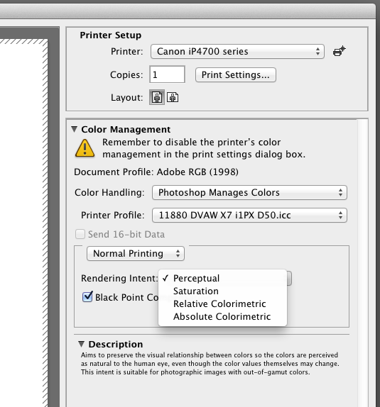
The question of choosing rendering intents in the Photoshop print dialogue is asked of us quite regularly so here is some info about how best to use these settings. The rendering intents are basically to tell the software how to handle colours in the file that may be out of the range of the output colour space aka target gamut (printer, ink & media combo).
Perceptual is a good choice when it comes to printing photographic images because this method tries to keep the balance between all the colours and shades in the image file relative to each other but scaled to fit within the output gamut. The result is a visually pleasing print, and is great for portfolios and general use – but be aware that colour values may be shifted to achieve this.
Relative Colorimetric is best for proofing with paper which matches the white of the intended final output and when accuracy is important; colours which are within target are not shifted while the colours outside of gamut are compressed into the nearest space. What this can lead to in those areas of the image is a flattening of colours when the file contains a gradation that is beyond the output range, so not as pleasing in a portfolio image. Use for proofing purposes and also can be good for non photographic content such as art reproduction.
Saturation is for printing business graphics like pie charts and suchlike where maximum colour saturation and not accuracy is called for.
Absolute Colorimetric is only for proofing and when the paper white point being used does not match the intended white point of the final output (newspaper, magazine etc). This results in the target paper tint being printed along with the image to fully simulate the proof conditions.
Black point compensation is best ticked for photographic output as this remaps the source black point to the target space and stops shadow details from clipping. It is automatically excluded in Absolute rendering for accuracy of proofing. When unticked under Relative Colorimetric it can sometimes reproduce art works with better accuracy.
Furthermore, an LED screen is a flat panel screen with a sizable arrangement of light-emitting diodes (LEDs) for displaying still images and videos, if that’s the subject matter that interests you. They are appropriate for outdoor events due to their high brightness. For further information, see https://ledeventscreenhire.co.uk/.